
Two Bold Worktop Colours in One Kitchen
Using two bold worktop colours, typically one on the perimeter and one on the island, can look deliberate if the colours relate, one leads and the join between zones is clear.
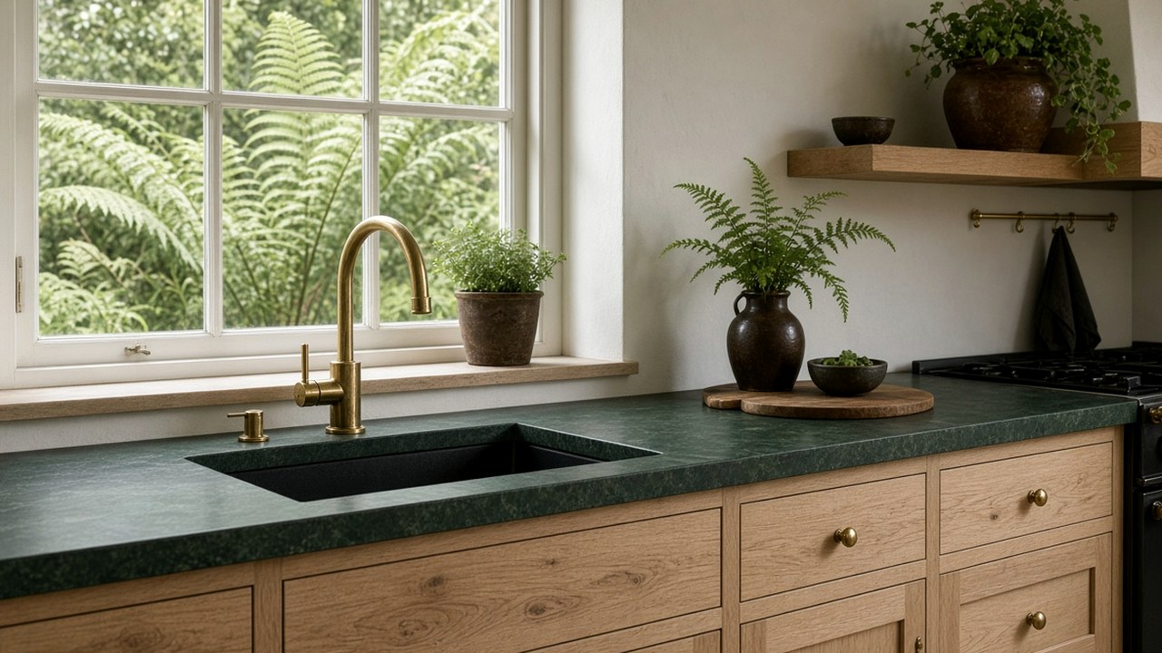
Some clients want more than one bold colour: a green perimeter and a terracotta island, or a navy run and an ochre breakfast bar. Two bold worktop colours can look deliberate and joyful, or confused. Tristone Worktops helps clients decide whether two colours suit their kitchen and how to make them work together.
Choose colours that relate
Colours that share an undertone, such as warm green and terracotta, or navy and ochre, feel related. Complementary colours, opposite each other on the colour wheel, create energy. Colours with clashing undertones can feel uncomfortable.
Tristone Worktops explains terracotta in a terracotta island that still feels like home.
- Shared undertones feel harmonious.
- Complementary colours create energy.
- Test samples together.
Let one colour lead
One colour should dominate, usually the larger area such as the perimeter run. The second colour, often on the island, is an accent. Equal amounts of two bold colours can compete.
Separate the zones clearly
Two worktop colours work best when they are physically separate: perimeter and island, kitchen and utility, or main run and breakfast bar. Changing colour mid-run can look like a mistake.
- Separate zones such as island and perimeter.
- Avoid changing colour mid-run.
- Use the change to define areas.
Keep cabinets and walls quieter
With two bold worktops, cabinets and walls should be calm. Tristone Worktops explains this in let the worktop be the only loud surface in the room.
Repeat each colour somewhere
Repeating each colour in a small accessory, a tile or artwork ties the scheme together.
Test the combination
Place samples of both colours together in the kitchen, under your lighting. Tristone Worktops explains lighting checks in judge green Tristone under the LEDs you will cook beneath.
Pairings that tend to work
Some two-colour combinations appear again and again in successful kitchens because the colours share a similar depth. Deep green with terracotta feels earthy and Mediterranean. Navy with ochre feels crisp and confident. Forest green with plaster pink feels soft but grown-up. Charcoal with a strong red feels graphic and modern.
What these pairings have in common is similar saturation. A very bright colour next to a very muted one often looks unbalanced, because one appears dull and the other shouts. When testing samples, check that both colours have a similar intensity when viewed from across the room.
- Deep green and terracotta.
- Navy and ochre.
- Forest green and plaster pink.
Proportion: a useful rule of thumb
Designers often use a loose proportion such as a larger dominant colour, a smaller secondary colour and a small accent. In a kitchen, the dominant colour might be the perimeter worktops, the secondary colour the island, and the accent a tile border, stool fabric or pendant shade. The idea is not a strict formula but a reminder that equal amounts of two strong colours can make a room feel restless.
If the island is very large compared with the perimeter runs, consider swapping the roles, so the island colour becomes dominant and the perimeter carries the secondary shade.
Edges, upstands and joins between colours
Where two colours meet, detailing matters. If a breakfast bar in one colour adjoins an island in another, a clear change of level or a visible return end makes the switch look intentional. A matching upstand behind each worktop keeps each zone distinct. Avoid meeting two colours on a flat butt joint in the middle of a run, which tends to look like an off-cut.
Solid surface allows neat, precise joins, but for a two-colour kitchen the aim is a deliberate break rather than an invisible seam.
- Use a change in level or a return end.
- Keep each colour's upstand consistent.
- Avoid flat colour changes mid-run.
Planning samples and approvals
Order samples of both colours together and view them side by side at the same time of day, under the same light. Photograph them in daylight and evening light. Show them next to your cabinet samples and flooring. Tristone Worktops explains how the brand approaches bold colour beside timber in saturated colour beside pale oak, without a nursery feel, which is useful if one of your two colours is paired with wood.
When one bold colour is enough
Two bold worktop colours are not right for every home. In a small kitchen, a single strong colour often has more impact. If your cabinets are already coloured, or you have a patterned floor, adding a second bold worktop colour may push the room into visual overload.
A simple test is to photograph your kitchen plan or a mood board in black and white. If the areas of strong tone look balanced, the scheme probably works. If one area looks heavy and another looks empty, adjust proportions before committing.
- Small kitchens often suit a single colour.
- Patterned floors reduce room for a second colour.
- A black and white photo helps check balance.
Linking the two colours with neutrals
Neutral materials act as a bridge between two bold colours. Pale oak, white walls, natural stone-look floors and brushed metal give the eye a rest and help both colours look intentional.
Questions about two worktop colours
Can I have two different worktop colours in one kitchen?
Yes, especially with separate zones such as perimeter and island.
Should both colours be bold?
They can be, but let one lead and keep the rest of the room calm.
Is it odd to change colour mid-run?
It usually looks accidental. Change colour between separate zones instead.
Which two worktop colours work well together?
Colours of similar depth often pair well, such as deep green and terracotta, navy and ochre, or forest green and plaster pink.
How much of each colour should I use?
Let one colour dominate, usually the larger area, with the second colour on a smaller zone such as the island.
How should two colours meet at a breakfast bar?
A change of level or a visible return end makes the switch look deliberate rather than accidental.
How can I tell if two colours will be too much?
Photograph a mood board in black and white. If the tones look balanced, the scheme is more likely to work.
Next step with Tristone Worktops
Order a sample, then request a fitted quote or browse the worktop collection. The colour should be judged in your own daylight before anyone templates the run.