
Ochre and Mustard Tristone Worktops Without the Seventies Hangover
Ochre and mustard worktops bring warmth and optimism, and pairing them with modern cabinets, crisp edges and restrained hardware stops the look tipping into retro pastiche.
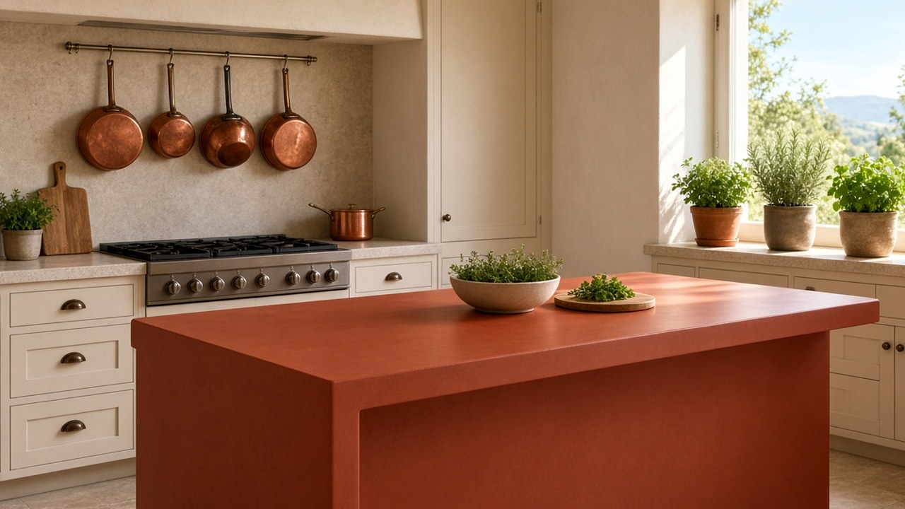
Ochre and mustard are enjoying a revival in British interiors, from sofas to tiles. On a kitchen worktop, they bring warmth and a sense of optimism, especially on grey winter mornings. The risk is a kitchen that looks like a seventies throwback rather than a considered modern room. Tristone Worktops helps clients choose ochre and mustard shades and pair them so the colour feels fresh.
Choose the right shade
Ochre ranges from earthy, brownish yellow to a softer golden tone. Mustard is typically brighter and more saturated. Earthy ochres feel grounded and work well with natural materials; brighter mustards feel playful and energetic. Look at samples in your kitchen under daylight and evening light, because yellow tones shift noticeably with lighting.
Tristone Worktops explains lighting checks in judge green Tristone under the LEDs you will cook beneath, and the same approach applies to yellows.
- Earthy ochres feel grounded.
- Brighter mustards feel playful.
- Check under both daylight and evening light.
Pair with modern cabinets
The seventies look came from pairing mustard with dark wood-grain doors, brown tiles and ornate handles. For a modern look, pair ochre with flat-fronted cabinets in white, warm grey, deep green or navy. Pale oak also works well. Tristone Worktops describes timber pairings in saturated colour beside pale oak, without a nursery feel.
Keep hardware restrained
Slim handles in brushed brass, black or stainless steel keep an ochre kitchen contemporary. Avoid chunky or ornate hardware that adds to the retro feel.
- Brushed brass complements warm yellows.
- Black hardware adds contrast.
- Keep handle shapes simple.
Use crisp edges and clean lines
A square or slightly eased edge profile keeps the worktop looking modern. Heavy bullnose or ogee edges can make a bold colour look dated. Keep the worktop thickness proportionate to the cabinets.
Limit the surrounding colour
Let the ochre worktop be the main colour. Keep splashbacks, walls and floors quieter, such as white tiles, plaster tones or pale timber. Tristone Worktops explains this in let the worktop be the only loud surface in the room.
Try it on an island first
If you love ochre but worry about committing to a whole kitchen, use it on the island and keep perimeter worktops neutral. Tristone Worktops explains island colour in a terracotta island that still feels like home.
Where ochre earns its place in the room
Ochre behaves differently depending on where it sits. On a long perimeter run under wall cabinets, it is partly shaded and reads deeper and browner than the sample. On an island under a rooflight, it catches daylight and can look almost golden by mid-afternoon. Before choosing the shade, think about which surface will carry the colour and how much direct light that surface receives over the day.
A useful trick is to tape a sample to the actual cabinet carcass, or a cardboard mock-up at worktop height, and leave it for a full day. Check it at breakfast, mid-afternoon and after dark with the kitchen lights on. Ochre that looks right at all three times is the one to order.
- Perimeter runs under wall units read deeper.
- Islands under rooflights read brighter and more golden.
- Test at breakfast, afternoon and evening before deciding.
Floors that calm a yellow worktop
Flooring has a big effect on whether ochre feels modern. Large-format pale stone-look tiles, limed or natural oak boards and polished concrete-effect finishes all give the yellow a neutral base. Orange-toned pine or honey-coloured laminate floors tend to amplify the retro feel, because they repeat the warm cast rather than balancing it.
If you are keeping an existing warm-toned floor, a more earthy, brown-leaning ochre often sits better than a bright mustard. A rug or runner in a cooler neutral near the island can also break up the warmth.
Splashback choices that support the colour
A plain white or off-white splashback is the safest partner for ochre, and a matching Tristone upstand keeps the colour continuous up to tile height. Handmade-style tiles with a slight glaze variation add texture without introducing a second strong colour. Deep green or navy tiles can work in a confident scheme, but they compete with the worktop, so use them on a smaller area such as behind the hob only.
Patterned encaustic tiles with yellow in the design can link the scheme together, although it is worth checking that the yellow in the tile is genuinely close to the worktop. Two slightly different yellows side by side tend to look like a mismatch rather than a choice.
- White or off-white tiles are the easiest match.
- A matching upstand keeps the line clean.
- Keep competing colours to a small area.
Living with a warm, bright surface
Mid-tone yellows are reasonably forgiving day to day. They hide light crumbs better than a very dark worktop and show fewer fingerprints than a glossy white. Turmeric, curry and tomato-based sauces are the spills to wipe promptly, simply because they are strongly coloured; on a non-porous solid surface they usually come away with warm soapy water when dealt with the same day. If you also like a pale kitchen elsewhere, British weather and bold solid colour looks at how bold tones feel through the darker months.
Questions about ochre and mustard worktops
Will a mustard worktop look dated?
Not if paired with modern cabinets, simple hardware and crisp edges.
Which cabinets suit an ochre worktop?
White, warm grey, deep green, navy and pale oak all work well.
Should I use ochre on an island or the whole kitchen?
An island is a good way to introduce the colour with less commitment.
Is ochre easier to live with than bright white?
Many people find a mid-tone ochre more forgiving of crumbs and fingerprints than a bright white, though strongly coloured spices should still be wiped up promptly.
What flooring goes best with a mustard worktop?
Pale stone-look tiles, limed or natural oak and concrete-effect finishes balance the warmth. Orange-toned timber floors tend to push the look towards retro.
Can I use yellow tiles with an ochre worktop?
Only if the yellows are genuinely close. Two slightly different yellows side by side often look like a mismatch.
Next step with Tristone Worktops
Order a sample, then request a fitted quote or browse the worktop collection. The colour should be judged in your own daylight before anyone templates the run.