
Ink and Navy Tristone Worktops for a Deep, Tailored Kitchen
Ink and navy worktops create a tailored, grown-up kitchen, and lighting, contrast with cabinets and practical care decide whether deep blue feels rich or gloomy.
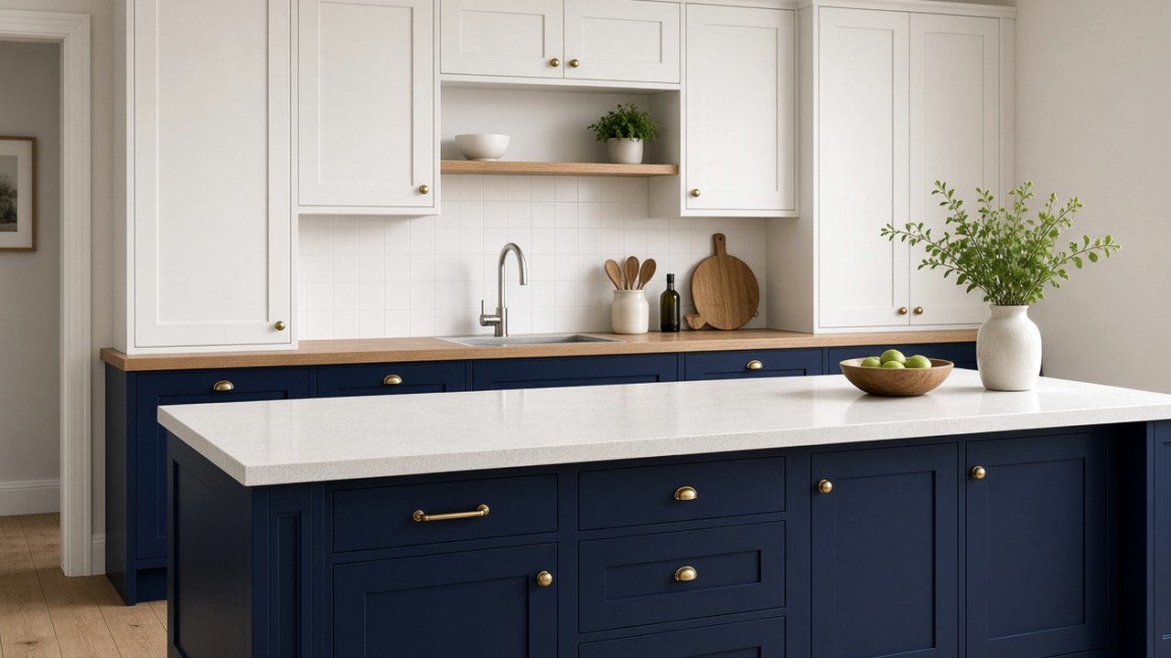
Navy has become one of Britain's favourite kitchen colours, usually on cabinet doors. Moving deep blue onto the worktop creates something more unusual: a tailored, grown-up surface that feels like a well-cut suit. Ink blues go deeper still, almost to black. Tristone Worktops helps clients use these shades so the kitchen feels rich rather than gloomy.
Choose between navy and ink
Navy is a recognisable deep blue. Ink is darker and can read almost black in low light, revealing its blue only in daylight. Navy feels classic and nautical; ink feels moody and sophisticated. Compare samples in your kitchen at different times of day.
- Navy is a clear deep blue.
- Ink reads nearly black in low light.
- Compare at different times of day.
Light it generously
Deep blue absorbs light. Good under-cabinet lighting keeps the work surface bright enough for cooking. Warm white lighting softens navy; cool white lighting makes it look crisper and cooler. Tristone Worktops explains lighting in judge green Tristone under the LEDs you will cook beneath.
Create contrast with cabinets
A navy worktop on navy cabinets can look monolithic. White, cream, warm grey or pale timber cabinets create contrast that lets the worktop read clearly. Tristone Worktops explains timber pairings in saturated colour beside pale oak, without a nursery feel.
- White and cream cabinets create crisp contrast.
- Pale timber adds warmth.
- Avoid matching navy on navy unless intentional.
Add warm accents
Brass taps and handles, copper pendants and warm timber shelves all complement deep blue. They add warmth and stop the kitchen feeling cold.
Consider where blue is placed
Deep blue works particularly well on islands, where it becomes a focal point. On perimeter runs, it can make a small kitchen feel enclosed. Tristone Worktops explains window light and blues in icy blues only where the windows can carry them.
Care for a dark worktop
Dark surfaces show dust, crumbs, water marks and limescale more readily. Wipe and dry regularly. If fine scratches build up over the years, a fabricator can usually refinish the surface. Tristone Worktops describes weather and bold colour in British weather and bold solid colour.
Reading navy samples properly
Deep blues are notoriously difficult to judge from a small sample. Viewed flat on a table, a navy sample can look almost black; tilted towards a window, it can suddenly look quite bright. Always view samples at worktop height and in the orientation they will be fitted, and compare them against your cabinet door sample rather than against a white sheet of paper, which exaggerates how dark they look.
It also helps to compare two or three blues side by side. Blues with a slight green undertone feel softer and more heritage; blues with a slight red or violet undertone feel richer and more formal. Seeing them together makes these undertones much easier to spot.
- View samples at worktop height, not flat on a table.
- Compare against your cabinet door, not white paper.
- Look for green versus violet undertones.
Brass, oak and other partners
Deep blue is at its best with materials that add warmth and texture. Unlacquered or brushed brass taps soften the formality of a navy surface and develop a gentle patina over time. Oiled oak shelving or a timber breakfast bar top adds a natural grain that stops the room feeling too polished. Pale terrazzo or stone-look floors give a light base that lifts the blue.
Cool metals can work too. Brushed stainless steel and nickel give a crisp, almost nautical look, which suits contemporary kitchens with white or light grey cabinets. Try to keep to one main metal finish in the kitchen so the blue does not end up fighting several competing accents.
Handling marks on a deep blue surface
Dark colours show dry residue more than mid-tones do. Hard water leaves pale rings where a glass or kettle sat; flour and icing sugar show immediately; smeared washing-up liquid can leave streaks. A two-cloth routine helps: wipe with a damp cloth and a little detergent, then buff dry with a clean microfibre cloth.
In hard-water areas, a water filter tap or softener can reduce limescale marks around the sink. Keep abrasive pads away from the surface; if light scratches appear over time, a solid surface worktop can usually be refinished by a fabricator rather than replaced.
- Wipe, then buff dry with microfibre.
- Hard-water areas show pale rings more.
- Refinishing can deal with light scratches.
Balancing a blue kitchen through the year
Navy feels cosy in winter and fresh in summer, but it depends on the room. North-facing kitchens with limited daylight can feel enclosed if every surface is dark. A navy island surrounded by pale perimeter worktops and white walls keeps the colour while protecting the brightness of the room. South-facing kitchens can take more blue, because strong daylight keeps it vivid. For a completely different warm alternative, ochre and mustard Tristone worktops shows how yellow tones behave in similar rooms.
Navy in open-plan and small kitchens
In an open-plan room, a navy worktop can link the kitchen to navy sofas, rugs or a painted dining wall, creating a thread of colour through the space. In a small galley, it is usually best kept to one run, with the opposite side in a lighter tone so the corridor does not feel narrow.
Questions about navy and ink worktops
Will a navy worktop make my kitchen dark?
It can in a small, dim kitchen. Good lighting and pale cabinets help.
Do dark worktops show marks?
Yes, water marks and dust show more readily on dark colours. Wipe and dry regularly.
Which metal finishes suit navy?
Brass and copper add warmth; chrome and steel keep it cool and crisp.
How do I stop a navy worktop looking streaky?
Wipe with a damp cloth and a little detergent, then buff dry with a clean microfibre cloth to remove residue.
Should I choose brass or chrome with a navy worktop?
Brass adds warmth and a softer, heritage feel; brushed steel or nickel gives a crisper, more contemporary look. Keeping to one main finish usually looks calmer.
Is navy suitable for a north-facing kitchen?
It can be, but limiting it to an island and keeping surrounding surfaces pale helps the room stay bright.
Does navy work in an open-plan kitchen?
Yes. It can tie the kitchen to navy furnishings or paint in the living area, creating a consistent thread of colour.
Next step with Tristone Worktops
Order a sample, then request a fitted quote or browse the worktop collection. The colour should be judged in your own daylight before anyone templates the run.